zondag 24 maart 2013

Hinepukohurangi and the Heron

The Maori symbolism research really was very useful.  I discovered that they saw the White Heron as a symbol for darling or treasure, perfect for Hinepukohurangi.  The Koru was also relevant as a pendant worn often by women depicting the affection in a relationship.  Also there is the Ngutu Kaka which is a representation of the female element and symbolic of the child within. 

I started by very quickly and roughly sketching some white herons.  Kirsten my mother happened to tell me the differnece between a mace and morning star during doing so, hence the addition :D


 A rough sketch of skeleton to get the proportions right, I have a terrible habit of making heads too big and legs too short.  I started with the wings but didn't really feel that was a good focus point.  I then tried the elegant long twisting neck and head as the top and this I thought was quite pretty.  The shape also allowed me to add a Koru.  I tried adding the Ngutu Kaka as well together with the wings as the skirt but I wasn't so keen on this, a bit too busy and distracting from the top of the dress.

I decided to focus on the very wispy feather of the wings instead and this also gave the bottom more of a misty feeling.  Potentially, small glass beads could be included to add in the dew drop effect.


Maori Symbolism Research

After having become a bit stuck with the other costumes, particularly with ideas for the two sisters, I decided I wanted more of a Maori influence.  After all what was the point of doing a Maori Myth if I didn't look to their symbols and stories for ideas and inspiration.  I found a really good list of names of symbols with descriptions and definitions.  The only thing was that there were no pictures.  So I took my time searching he net for good examples of the symbols.  This was very enjoyable, interesting and inspiring.


Hinepukohurangi: Dew Drops

 I tried to make a start on the Hinepukohurangi costumes the other day but I couldn't really seem to grasp it.  The first ones were just badly drawn fantasy dresses.  I quite like the woven bosom part of the second dress but that was about it. 


I then took the sweeping shape of the last fern dress and only drew this onto the template and added dew droplets like thos left by mist, as Hinepukhurangi means Mist-Girl.  At first I thought I was quite happy with this but when coming back to it later I didn't really think it was particularly interesting.  Maybe it could work as a detail together with a different concept but I feel it's a bit boring on it's own.


donderdag 21 maart 2013

More page sketches

I really want the pages to be pretty full as the songs are as well and I think that will go together better.  I've done the rough sketches for two more of the pages :D  They might not be quit visible to you but I will soon draw out the larger sketches and then they will become more clear.  Just one more to go now and off course I need to figure out how I'm going to do the text pages on the back of the picture ones.


Dry Needle-Point Etching and Acrylic

First of all I re-drew the page as I mentioned in the previous post the last one wasn't really right.

Now that this was a lot closer to be right than the previous drawing I scratched it into a dry-needle point plate.

I printed it in black and white and tried to add colour.  Unfortunately I didn't really get the effect I wanted, I think that's something I would have to have a lot more practise in before getting right.  I don't have great scans or photos yet but here are some samples of what I did.


As I wasn't really happy with these I tried to make digital changes to see if I could improve them but any qualities they did have were only lost.


I then went back to my inspiration to see what I could try next to improve it.  I mainly looked at the Fuseli paintings but also had a quick look at the coloured stills from George Méliès' films.

I felt that liht was a really important element and one also important to my project.  I decided to do my favourite and my best and paint the different layers.


I then photoshopped the different layers together.


I then showed these both, the etchings and painting to my teacher Frank.  He did really like the etching because of the motion that it added I do agree with him.  He also made the comparison to what I was doing to the paintings by William Blake.


Thinking of the comments Frank had made and the colours and textures in the William Blake pictures, I then decided to combine the etchings that I did and the painting and by jove I think I've found the answer. 


I particularly like this last one as the layers blend together really well.  Obviously these images are a bit rough as they're just sketches but I would say that this is the technique I would like to continue with.

donderdag 7 maart 2013

Etching + Digital Colouring

This was only a very quick experiment to get a general idea.  I tried colouring in my stag head digitally.  If I spent more time on it, it would probably be better but I think for the cd cover I need to do colour printing to get a better effect.  The bubble that is printed below has far more interesting textures and colour changes for example than the digital colouring.


Sketching CD Cover ->Technique Development

After having done some charcter design drawing during Samantha's lesson (pictures not on here yet as the drawings are lying at school) I decided to try and do the same with the God Cernunnos.  It really didn't work at all but here they are anyway.


Instead of concentrating on the character I tried to draw a layout for the Isis/Cernunnos page for the CD Cover.  The idea is that the antlers of Cernunnos and the wings of Isis will interlink representing the bind between Man and Women, a common theme of the two deitites. Using the concept used by the Egyptians (and many other civilisations) I want to add in buildings, animals etc that are a lot smaller in scale to Isis and Cernunnos to show they are gods.


Next I started to sketch for the Andro page, based around a circle dance.  Samantha said we have to draw something everyday we find difficult (which I haven't been too good at keeping up, but I will try harder) so I wanted to draw some people in movement as I find this pretty tricky and it's pretty relevant to the Circle Dance page.  The teachers had suggested to someone else in the class to look at Muybridge for dancing people so I decided to do the same.


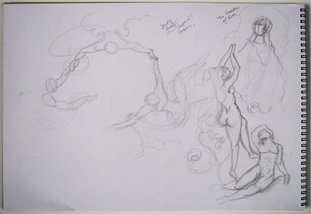
I wasn't particularly happy with this sort of movement for the cover, I wanted it to be more divine. Also it would make it very hard to fit onto such a small ring.  I think after that I googled illustrated movement or something along those lines anyway.  I spotted this picture (left below) "The Shepard's Dream" which I thought could be an interesting approach: to draw the people from above, size wise it's far more logical and a bit more interesting.

It turned out the painting is by Fuseli who I know for the painting of the demon sitting on the reclining lady with a horse in the dark background.  I hadn't actually looked into his work before and it really is sooo beautiful.  I really love the light dark contrasts he uses and the natural colours, stunning.


I just did a quick copy sketch of the two above just to get in the mood.  I also just wanted to try to draw a bit faster without tryiong to get everything realistically correct.


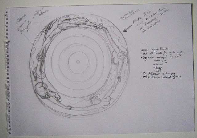
 After having done this I made a sketch for my Andro page based in the sketches I did from Fuseli's work. 


I discovered that the first page would have to have a wider band to be able to fit anything interesting on it, as you can see below the protoype of that first ring page is very narrow.  Ablove I drew in the rings of the other pages just to show that changing the size wouldn't have any ill effects for the overal composition.


Next I coloured drew out the sketch with a bit more detail.  I changed the arms to more ribbin-like features.
I wanted to try out the theme of stained glass window drawing.   The colours I took from the ribbons used in a May Pole (part of Pagan circle dance ritual for Beltane).


This picture really isn't right at all!!!  Points of Criticism:

-The colours really don't capture the mysterious atmosphere of the album. 
-I don't like the arms as ribbons, they look more like tentacles.  Other it's an interesting metaphore for connection I want them to be more human.
-The characters should all be facing the centre to draw the gaze in.
-The technique is far to static for the poetic album and for the concept of movement. 
Clearly the stained-glass idea is just not going to work for this project.
-By only using women the message of connectivity is limited.

Points for improvement in next sketch: 

-Draw normal arms -> Use more woven ribbons from the may-pole to add the message of connectivity instead  
-Don't only draw woman -> Add a man, I think also adding animals is a good idea.  I would like to add a stag and a doe as the album is based around Cernunnos and the Stag is his animal symbol.  By combining the these characters I can symbolise the balance between man and woman and human and animal which is also a very important symbolism of Cernunnos.
-Use different colours -> Use darker colours like in Fuseli's work so I can put a light focus on particular points.  This is a better conection to my manner of working in general and it will fit in better with the atmosphere of the album.


 -Use a different technique to get the movement better and that will fit in with the whole album

Technique wise I would say so far I am the most happy with my experimentations with dry-needlepoint.  They have a misty kind of effect which creates that level of mystcism.


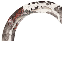
 While searching through my image collection I found a photocopy which caught my eye.  Sadly I didn't write down the book it came from or the illustrator, only a quote from the book.


Looking at it closely it looks like a Dry Needle Point Etch which has been worked with lots of colour to get a really amazing and atmospheric effect.  I'd like to try this out because I think it could be the potential right next step for getting the atmosphere, colour and technique right for my cover.